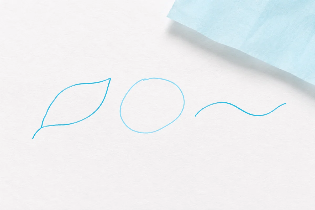
Illustration often arrives in a design conversation as a finishing touch: something expressive to place beside the words. It can also begin much earlier, helping define the character and behaviour of the identity itself.
A line can feel patient or restless. A shape can be precise, rough, light or generous. Before an illustration depicts a recognisable subject, those qualities already communicate something. Considering them alongside typography and colour gives the whole identity a stronger connection.
Look for a shared character
Start by exploring how the image should feel rather than asking only what it should show. A loose organic line suggests a different world from a clean geometric construction. Neither approach is a default answer. The choice depends on the story and on the other elements that need to work beside it.
It helps to draw several small variations. Change the weight of the line, the distance between shapes or the amount of detail. Place the drawings beside a sample headline and a colour swatch. The most useful direction is often the one that creates a conversation between those parts.
Build a family, not a single picture
An illustration system needs enough consistency to feel related and enough flexibility to stay useful. A family might share a particular curve, a limited set of marks or a repeated way of handling texture. Those decisions can connect images that show very different subjects.
Try the drawings at different sizes. A large composition might invite detailed observation, while a tiny label needs a clearer silhouette. A simplified version should retain the same character. This is easier when the visual language has a few identifiable ingredients rather than many unrelated effects.
Give the image room to work
Illustration and empty space are partners. Filling every available area can hide the qualities that made the drawing interesting in the first place. A careful crop, a pause between shapes or a small drawing next to quiet typography can make the image feel more deliberate.
The result does not need to look identical in every application. What matters is the relationship between the parts. When that relationship is clear, illustration becomes a way of speaking rather than a piece of decoration.